Scroll
The Brief
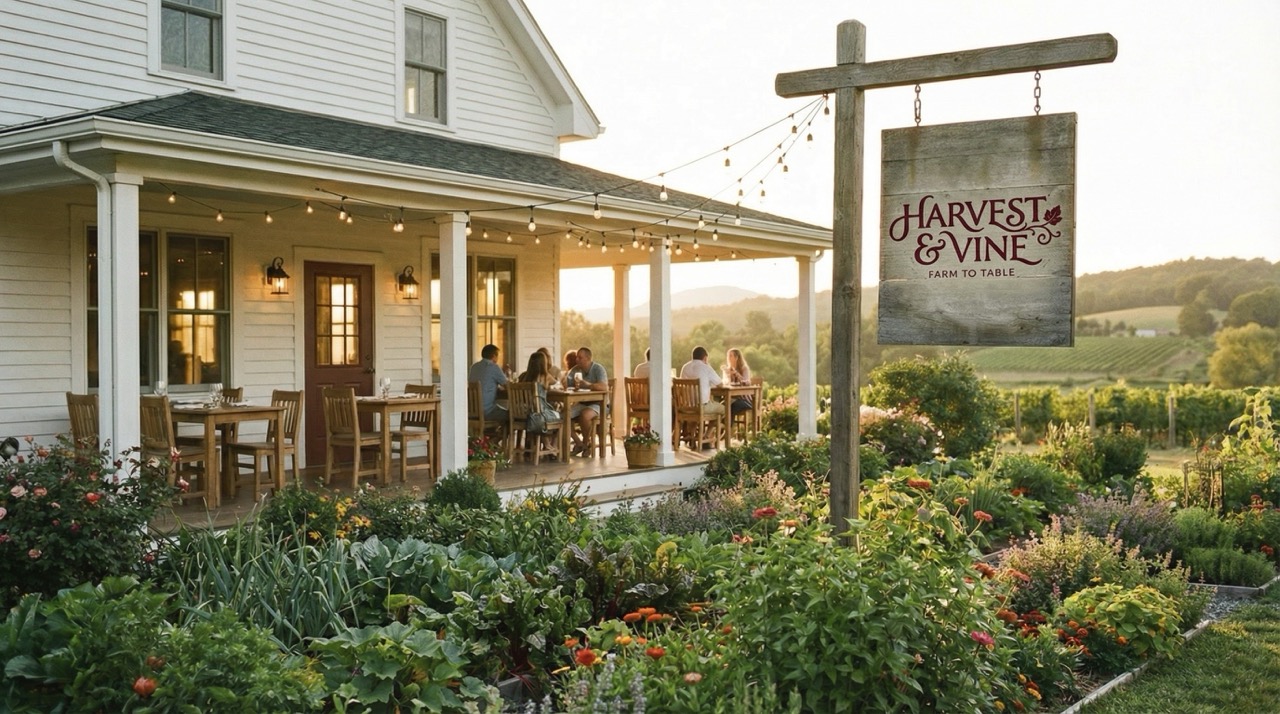
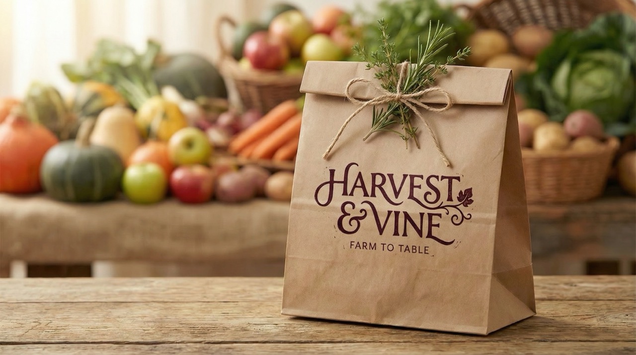
Harvest & Vine is a chef-driven farm-to-table restaurant built around a singular belief: that the best meals begin in the soil. They came to Herald Lane seeking a brand identity that could carry that conviction without over-explaining it.
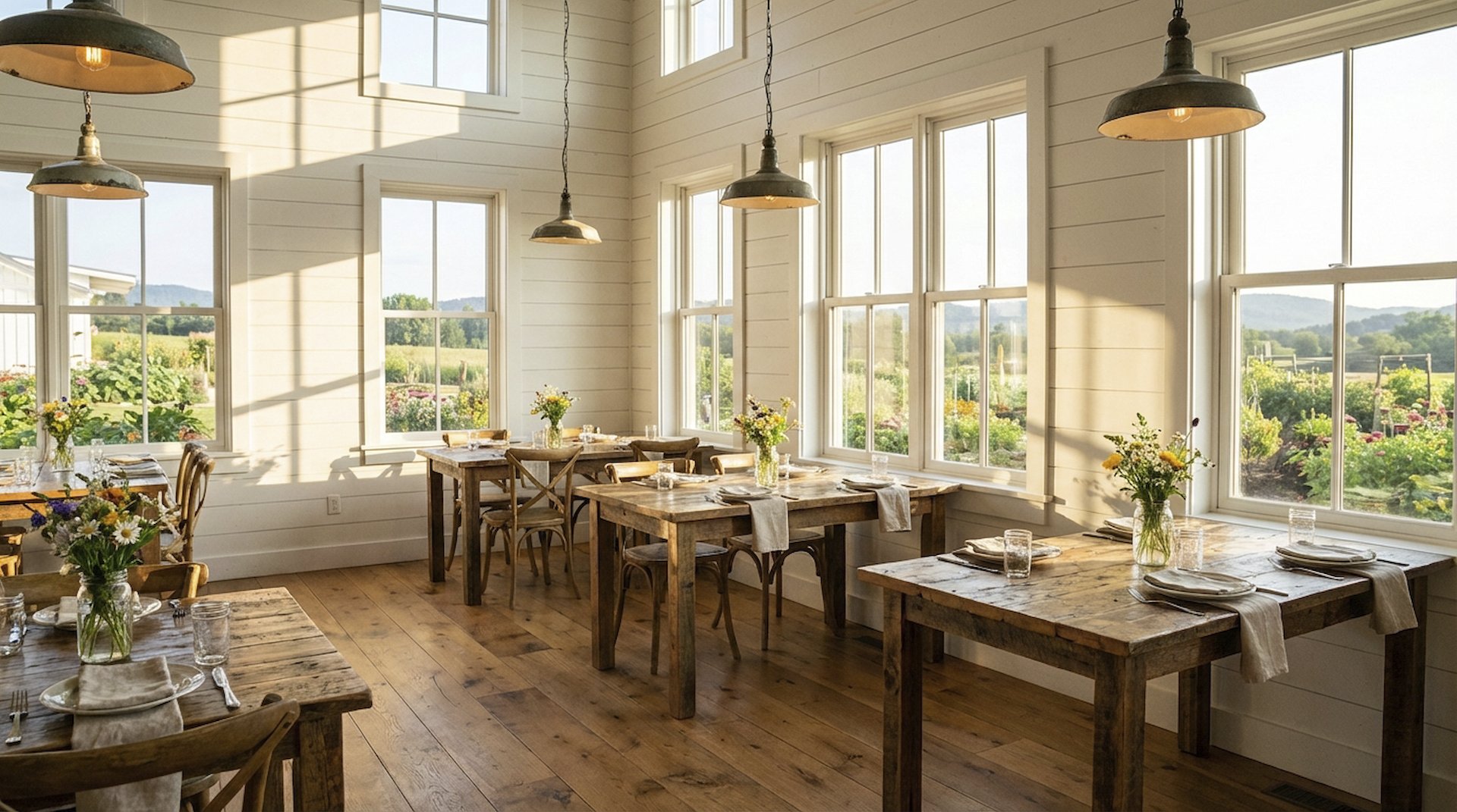
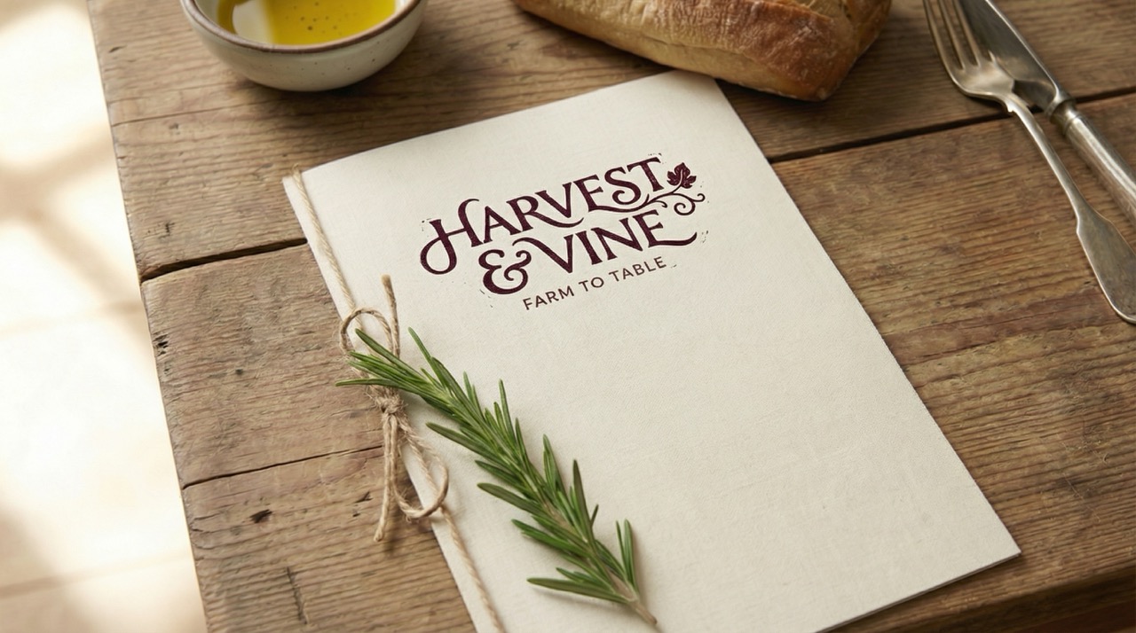
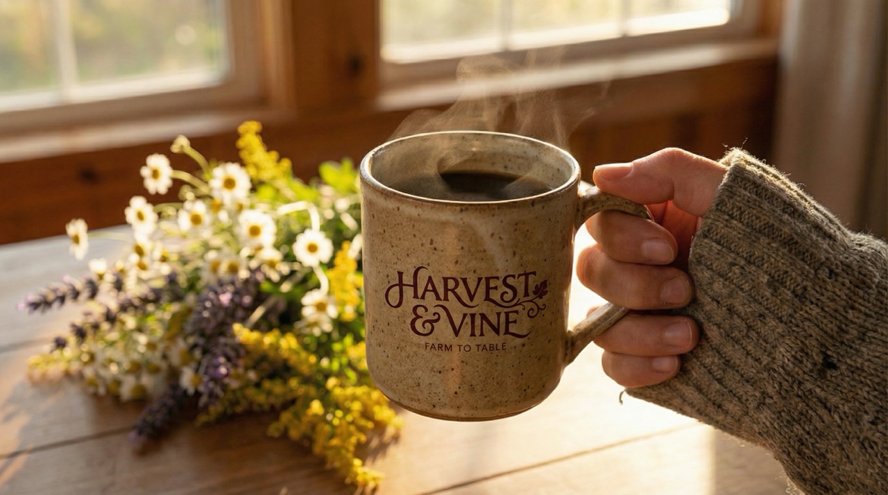
We built a visual language rooted in the warmth of a working farmhouse — earthy greens, worn linen, a woodblock-print logo that feels grown rather than manufactured. Every touchpoint speaks the same quiet, unhurried language as the food itself.
Brand Identity
Harvest & Vine is a chef-driven farm-to-table restaurant for guests who believe a meal is more than food — it's a record of a place, a season, and the hands that tended it.
Brand Promise
Every plate tells you exactly where you are and what time of year it is.
“Grown here. Made here. Meant for you.”
01
Provenance
Every ingredient has a story and a source. We know both. The menu changes because the land does — and that's exactly the point.
02
Intention
Nothing on the plate arrived by accident. Every combination is considered, every technique deliberate. Cooking as a form of respect.
03
Seasonality
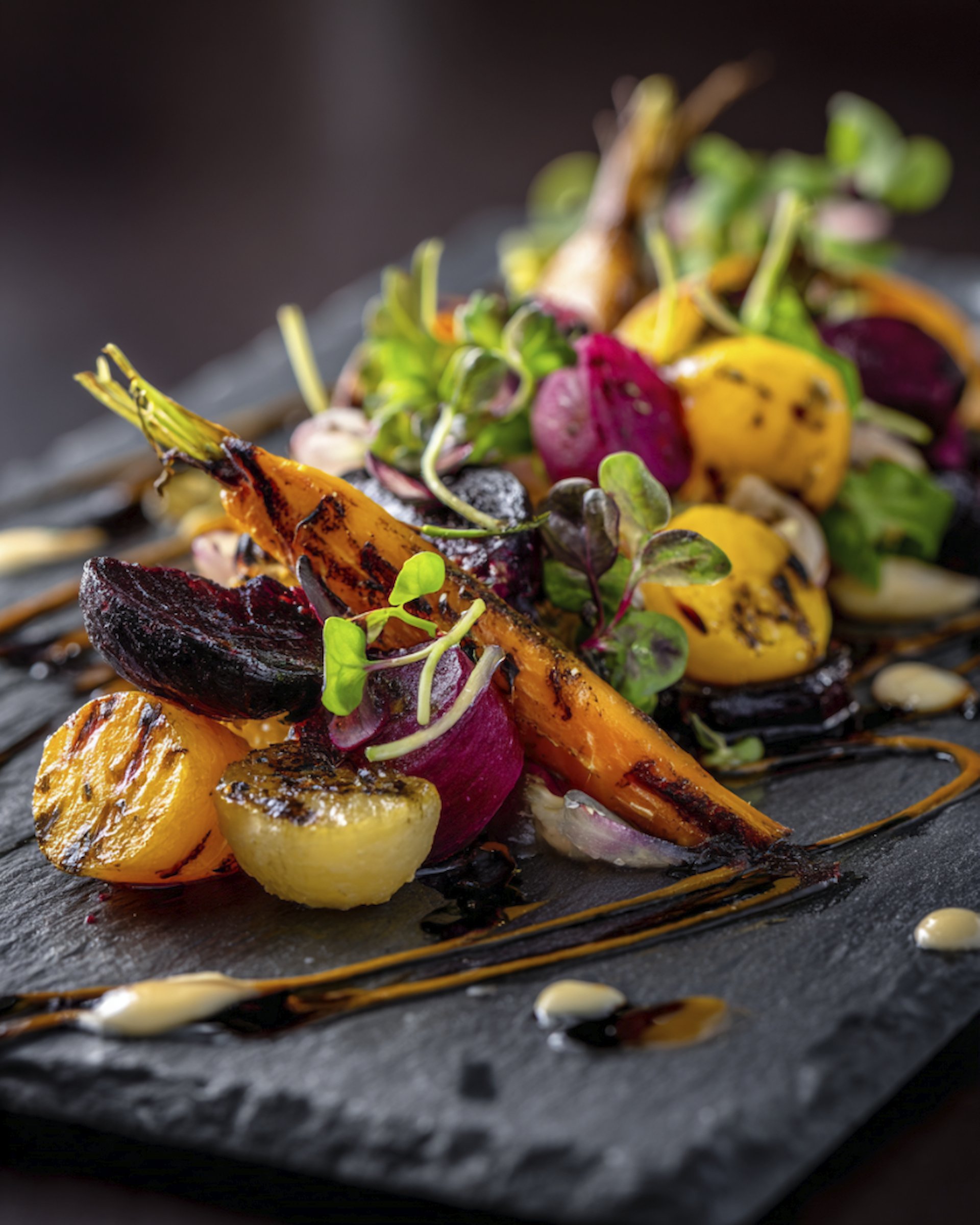
We don't fight the calendar. We follow it. What grows together, goes together. The menu is a portrait of right now.
04
Warmth
Farm-to-table doesn't mean austere. Harvest & Vine is generous — with portions, with hospitality, with the kind of welcome that makes strangers feel like regulars.
05
Community
The farmers, the foragers, the fishermen — they're collaborators. Every meal is a collective effort worth celebrating.
Color Theory
A palette built with intention.
Fresh linen on a morning table. Clean without coldness.
A reduced wine sauce. Depth, richness, appetite.
A kitchen garden in July. Freshness and provenance.
The farmhouse table itself. Warmth, age, honesty.
Late afternoon light on bare soil. Ties everything together.
Typography System
Type chosen with intention.
Harvest & Vine
Grown from the land we call home.
Playfair Display carries the organic curves of something hand-drawn in a field journal. Source Sans 3 brings honest, unpretentious readability — the chalkboard to the serif's calligraphy.
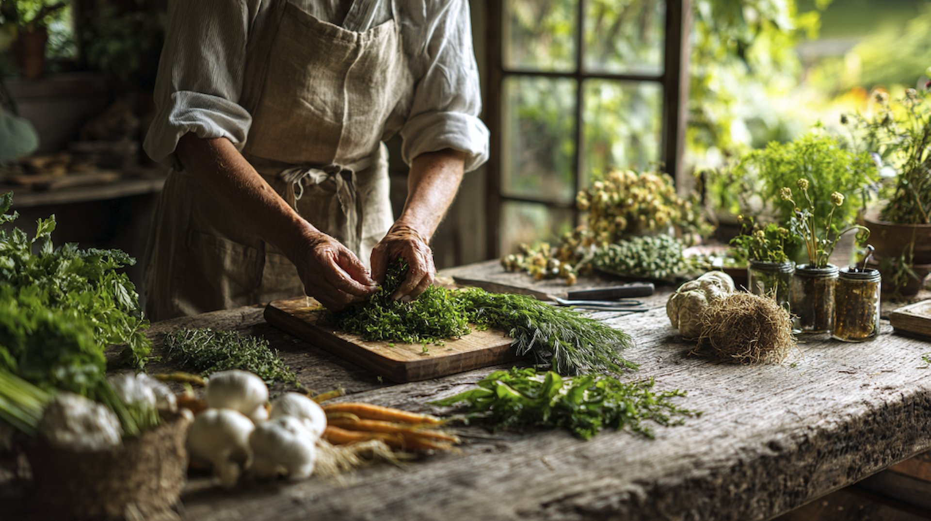
Photography Direction
How we see this brand.
Natural window light always — never flash. Shoot food at table height, not overhead. Hands in frame when possible. Imperfection over perfection. A slightly wilted herb is more honest than a pristine garnish. Warm and golden, never clinical.