Scroll
The Brief
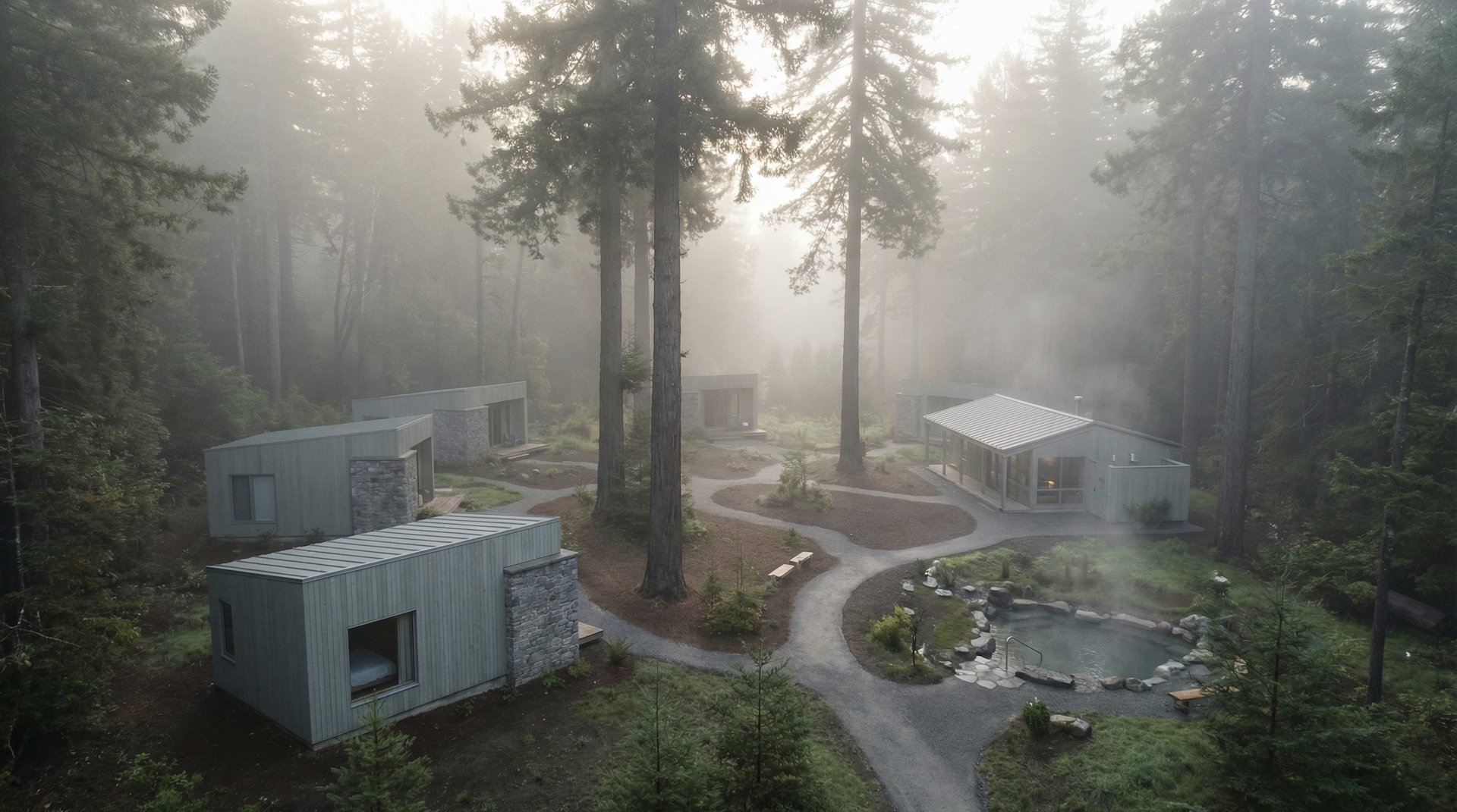
The Clearing is a forest wellness retreat built around a deceptively simple premise: that the most profound luxury is space — space from noise, from pace, from the weight of everything waiting. They asked Herald Lane to build a brand that said everything without saying very much at all.
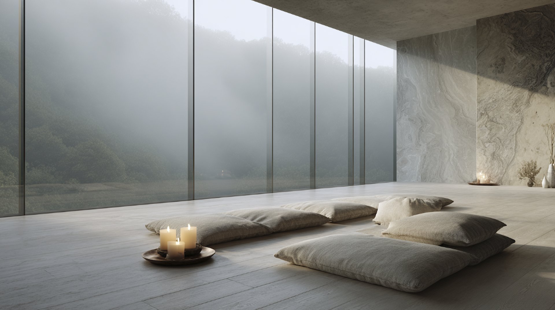
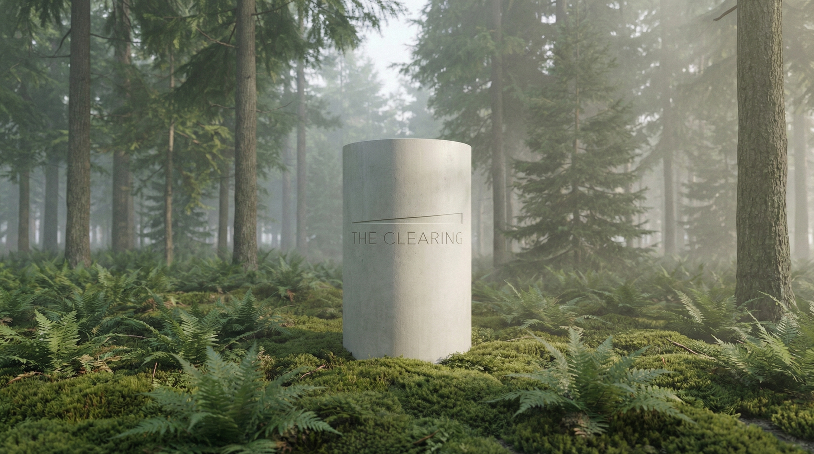
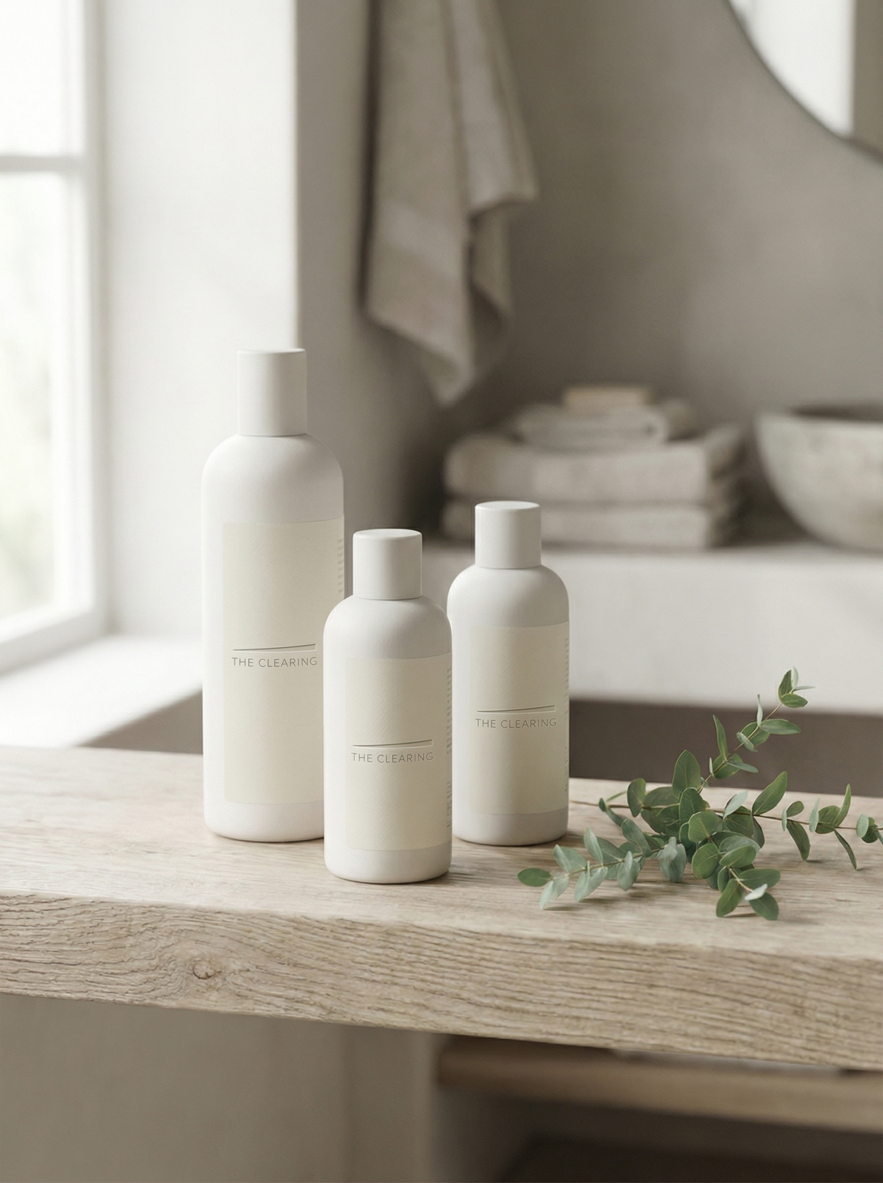
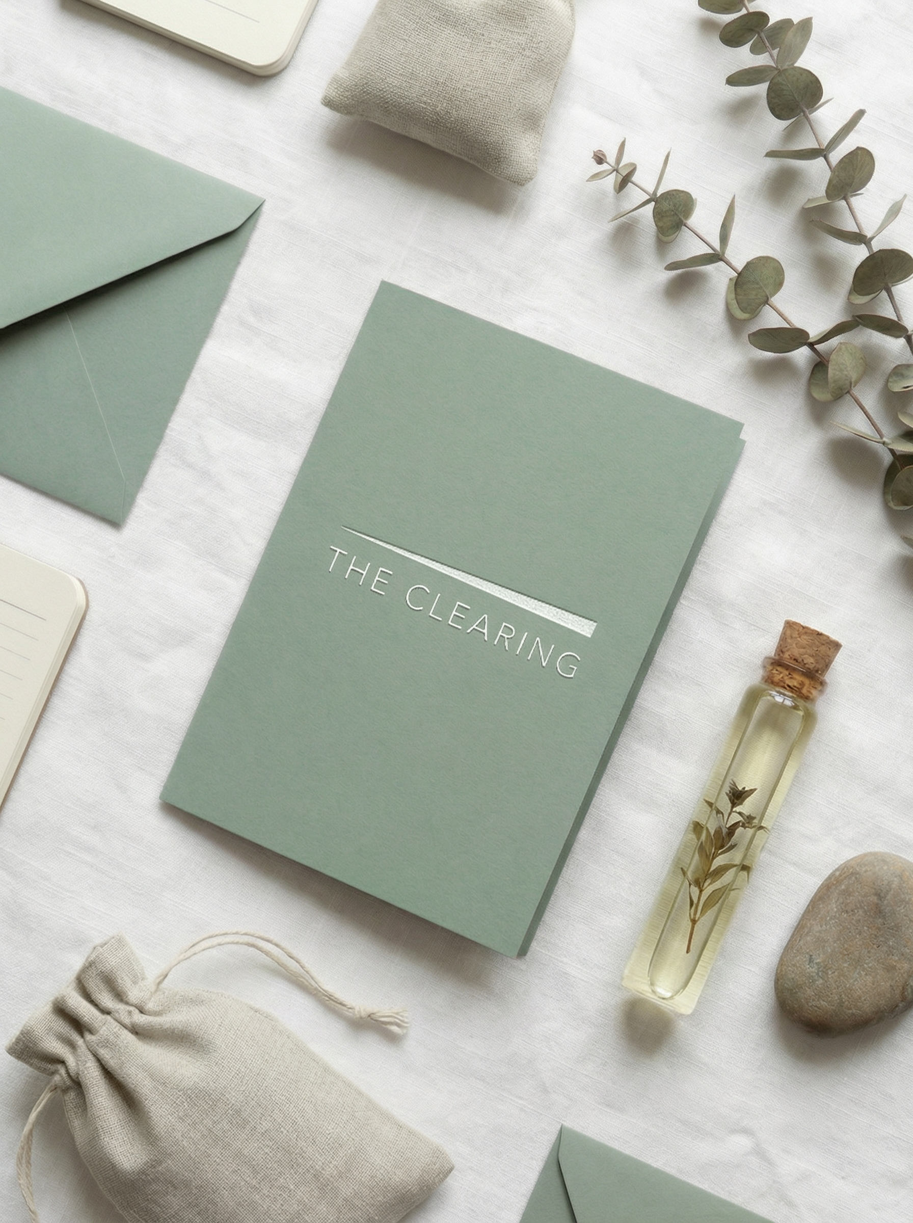
We developed an identity rooted in restraint — celadon, stone, and white — with a logo mark so quiet it almost disappears into the paper. Typography chosen for breath and space. Every element designed to feel like the first exhale after a long drive into the mountains.

Brand Identity
The Clearing is a forest wellness retreat for people who have forgotten what silence sounds like — designed for those who need space not to escape their life, but to finally hear it.
Brand Promise
You will leave with the kind of quiet that stays with you long after you've returned to the noise.
“Find the quiet. Find yourself.”
01
Stillness
Not the absence of noise. The presence of peace. Every space at The Clearing is designed to help guests stop moving long enough to arrive.
02
Intention
Every element — the materials, the light, the schedule, the menu — serves the guest's return to themselves.
03
Nature as Teacher
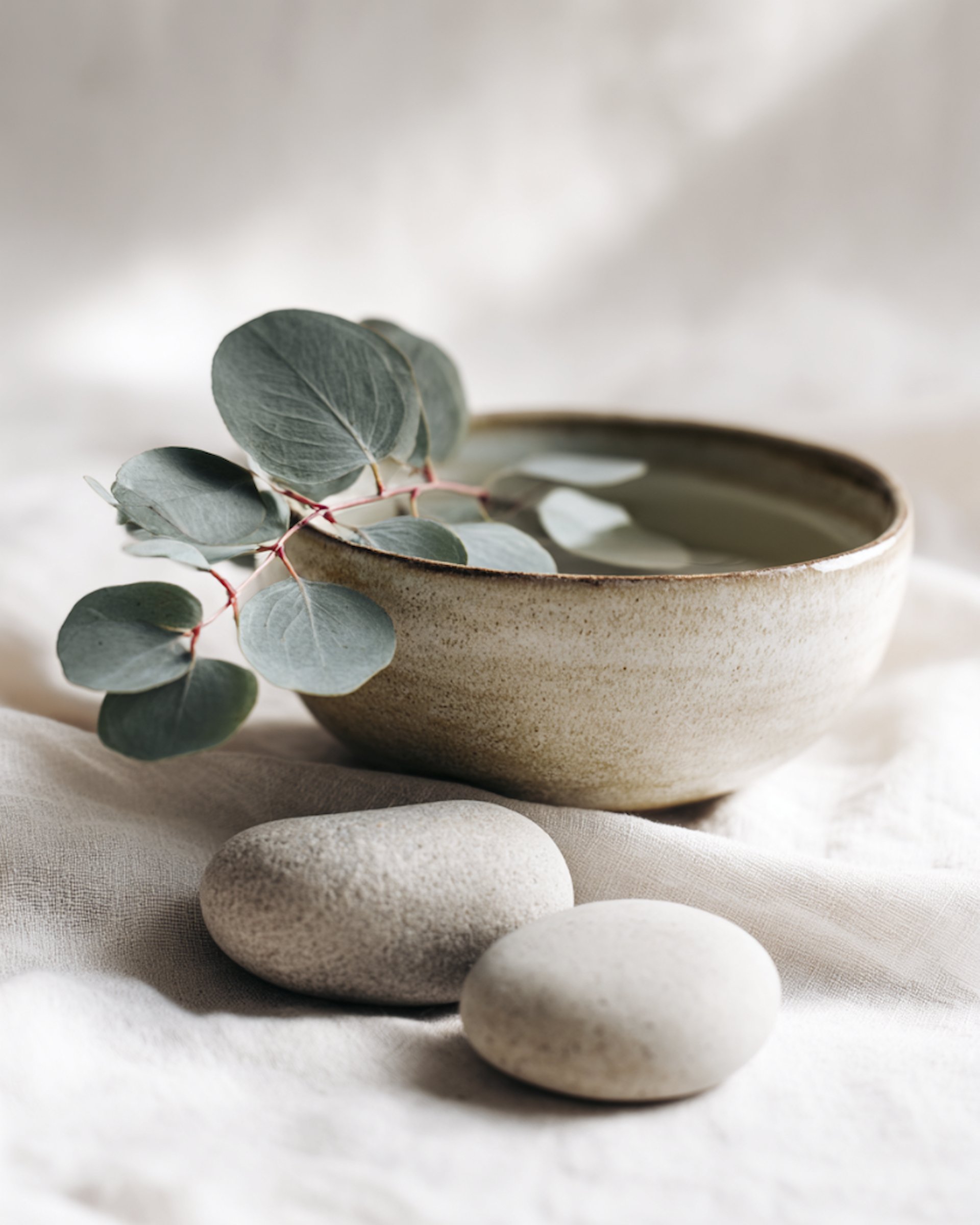
The forest is not a backdrop. It is the curriculum. The Clearing exists at the edge of the wild because that's where the most important work happens.
04
Gentleness
Wellness without judgment. There is no right way to restore yourself here. The Clearing meets every guest exactly where they are.
05
Simplicity
Luxury is not what's added. It's what's removed. The Clearing strips away everything that doesn't serve so that what remains can finally breathe.
Color Theory
A palette built with intention.
Morning mist on bark. Pure without sterility.
Lichen on old stone. Triggers calm in the nervous system.
The forest floor in autumn. Human warmth in the palette.
Forest canopy. Depth, protection, shelter.
Aged natural fiber in afternoon light. The color of rest.
Typography System
Type chosen with intention.
The Clearing
Where silence becomes something you can feel.
DM Sans Light with generous tracking makes silence visible on the page — space between letters is as intentional as space in the forest. Lora Italic brings meditative warmth to body text without breaking the stillness.
Photography Direction
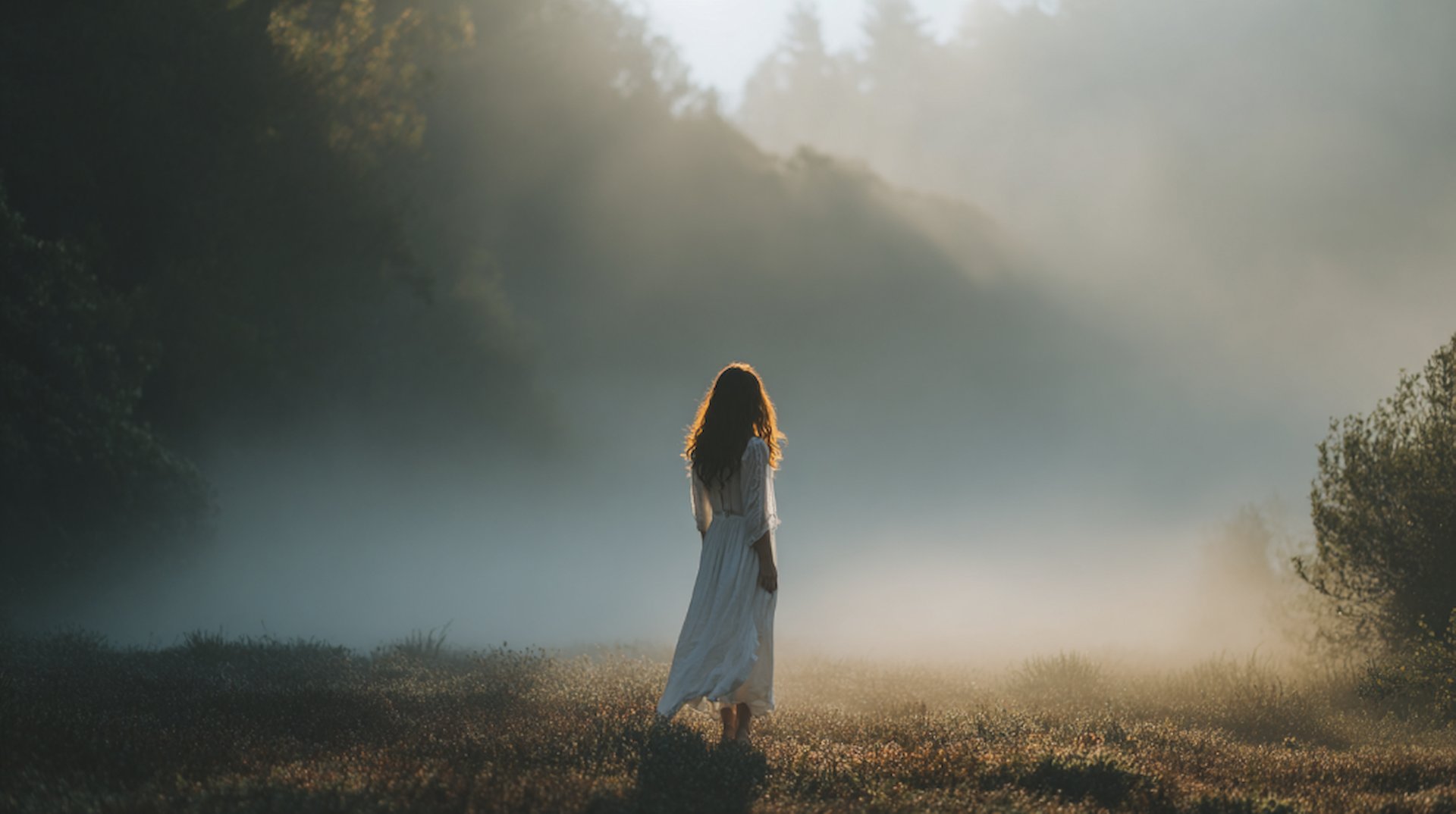
How we see this brand.
Only natural light — golden hour and soft overcast preferred. Shoot through glass, through trees, through doorways — always suggest layers of depth. White and linen tones dominant. People in repose, never performing wellness. Long lenses that compress the forest into softness.