Scroll
The Brief
The Anvil Brewing Co. came to Herald Lane with a clear vision and no apologies for it — a craft brewery that celebrates fire, iron, and the tradition of making things by hand. No soft edges, no hedge. The brand had to feel like it was stamped from hot metal, not printed on a laptop.
We built a complete brand identity rooted in the forge: a logo that reads like an iron stamp, a color system pulled from the colors of combustion, photography that treats amber light and raw texture as the primary design elements, and a cinematic entrance film that brings the brand to life before a word is spoken.
Brand Identity
The Anvil Brewing Co. is a craft brewery for people who believe the best things are made by hand, shaped by heat, and finished with intention — where every pint is a product of the forge.
Brand Promise
You will taste the difference that giving a damn makes.
“Forged with fire. Finished with craft.”
01
Fire
Everything worth having was shaped by heat. The Anvil doesn't apologize for intensity — in the brew, in the space, in the brand.
02
Craft
There are no shortcuts at the forge. Every batch is made by hand, with attention, by people who know the difference between made and manufactured.
03
Honesty
Iron doesn't lie. The Anvil brand is what it says it is — raw, warm, real. No pretense, no performance. Just the thing itself.
04
Community
The forge was always a gathering place. The taproom carries that forward — a space where people come together around something made well.
05
Permanence
What's forged lasts. The Anvil is building something meant to be here in twenty years — a brand, a taproom, a tradition worth passing down.
Color Theory
A palette built with intention.
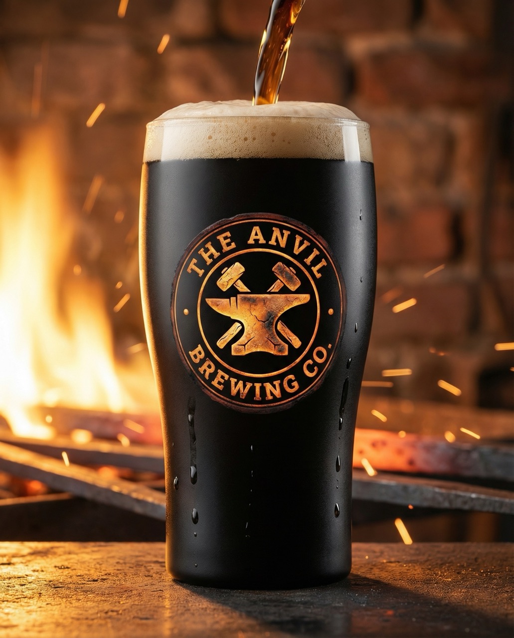
The color of a cold anvil, aged iron, and old growth timber. The brand's anchor — everything is measured against this depth.
Iron at working temperature. The exact color of metal just before it becomes malleable — the moment when craft becomes possible.
The color of a deep amber ale held up to the light. Warmth, appetite, the reward at the end of the process.
Aged iron, slate, the walls of a working forge. The structural neutral that keeps the warmth honest.
The pale ash around a fire that has done its work. The resting tone — light enough to breathe, warm enough to belong.
Typography System
Type chosen with intention.
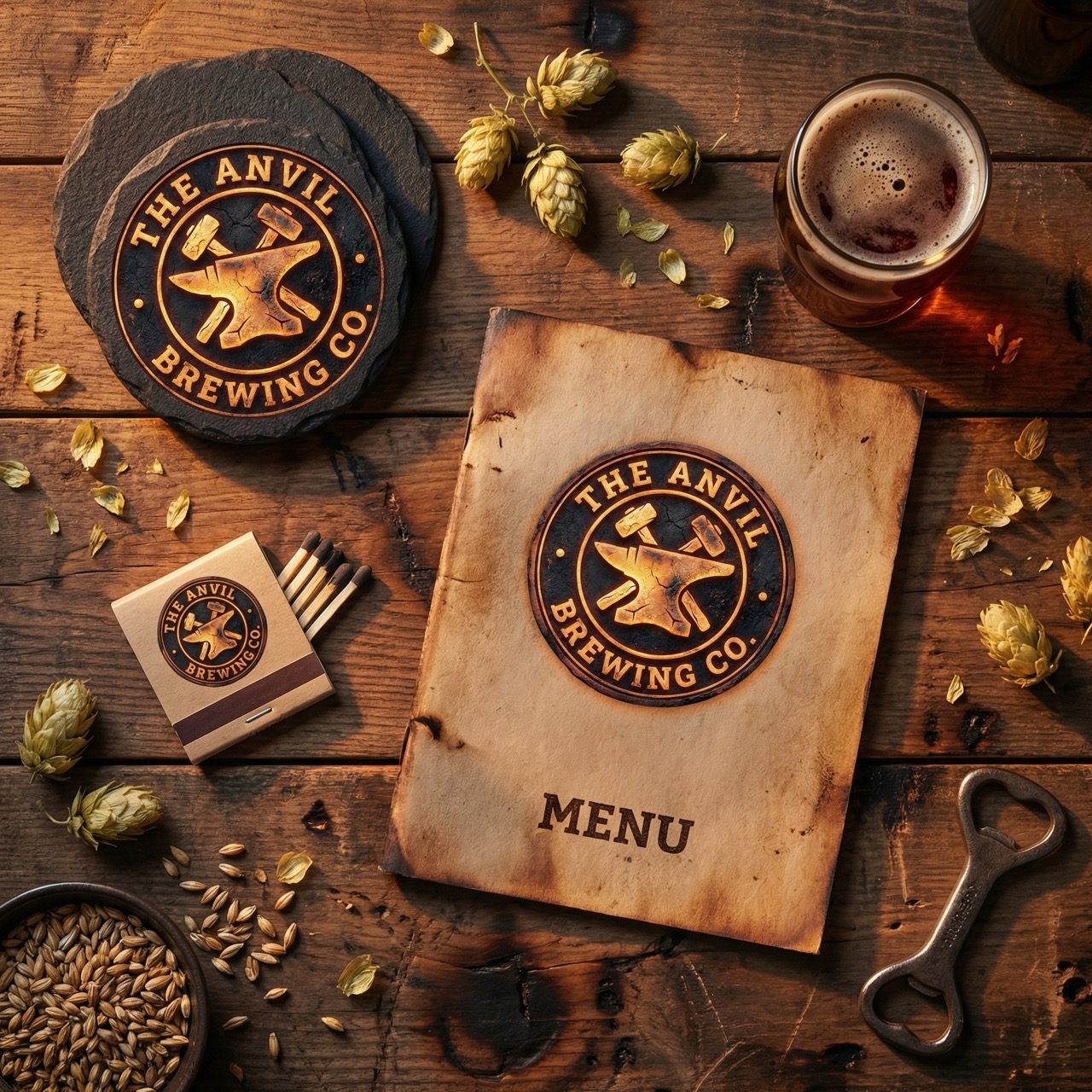
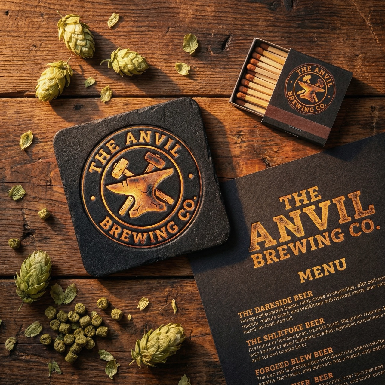
The Anvil
Headlines, logo wordmark, taproom signageMade by hand. Shaped by fire.
Body copy, menu descriptions, tap labelsZilla Slab's heavy slab serifs carry the weight of iron and stone — permanent, unmovable, made to last. Lora brings the human warmth of the craftsman's hand, ensuring the brand never tips from industrial into cold.
Photography Direction
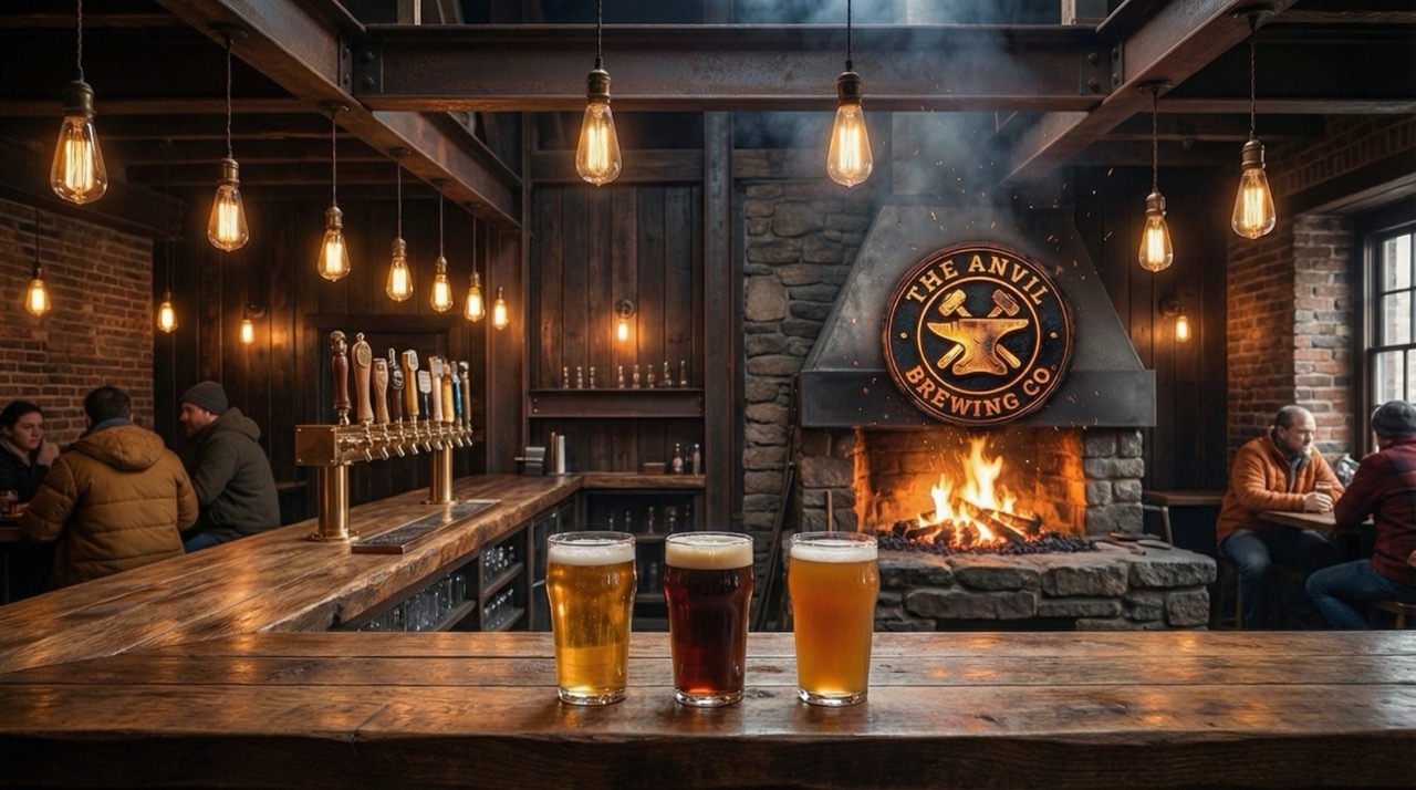
How we see this brand.
Shoot toward the light source — always. Amber tungsten over daylight. Texture is the subject: iron grain, oak pores, condensation on cold glass. Beer at pour height, never overhead. Hands in frame when possible — the brewer's, the bartender's, the regular's. Darkness earns its place; the brand lives in the contrast between shadow and firelight.