Scroll
The Brief
The Fallow is an art-forward urban boutique hotel founded on a single conviction: that the most creative people need space to stop before they can start again. Fallow — as in the field left intentionally unplanted so that it can restore itself — became both name and philosophy.
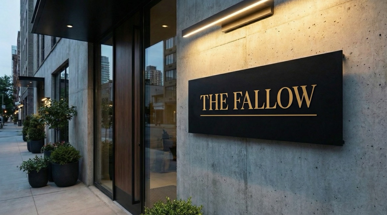
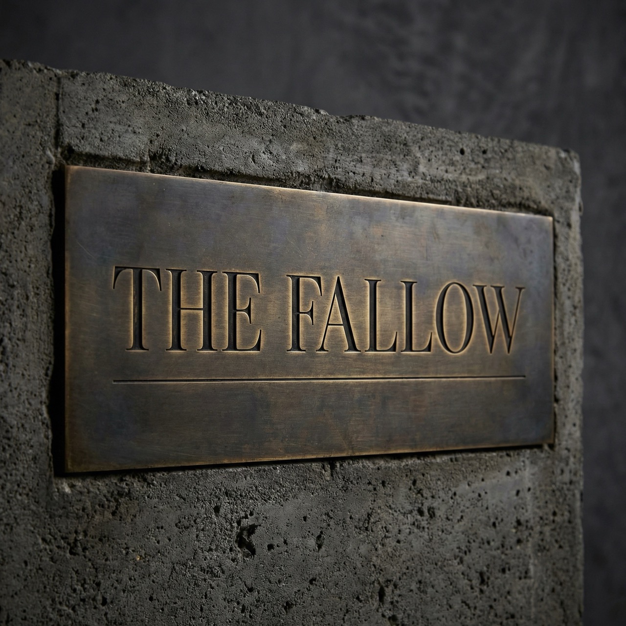
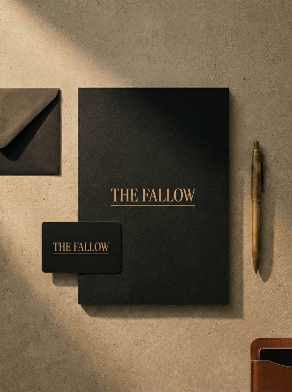
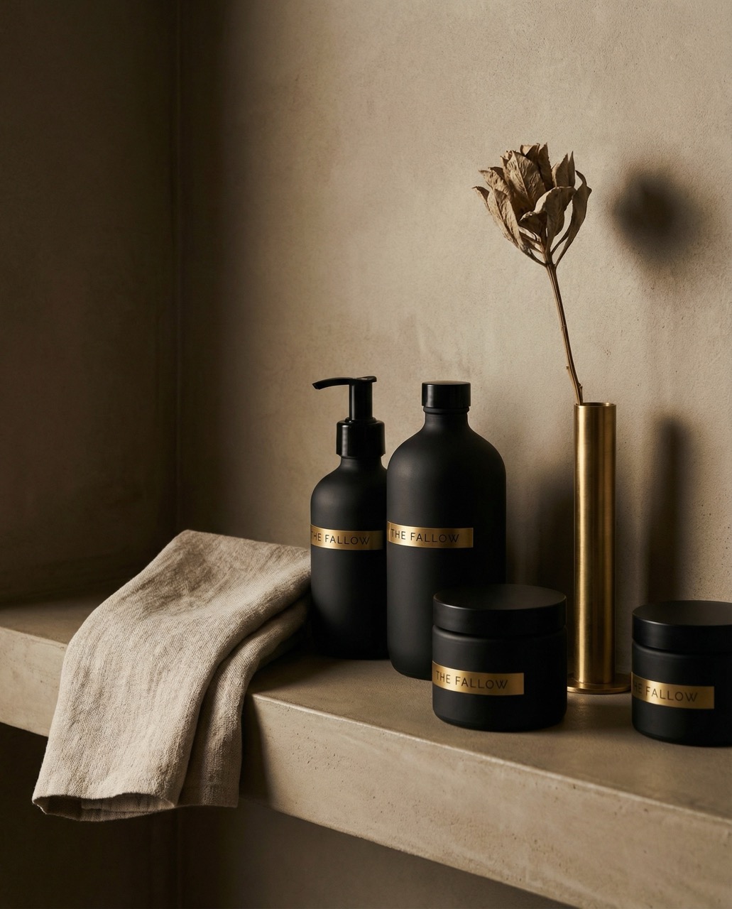
Herald Lane developed a complete brand identity built around restraint. Warm concrete, matte black, aged brass. A logo mark with the dramatic contrast of a Didone serif — hairline thins meeting heavy strokes — that feels like it belongs on a gallery wall. Every touchpoint designed to feel like a long exhale in the middle of a city that never stops.
Brand Identity
The Fallow is an art-forward urban boutique hotel for creative minds who understand that the most productive thing they can do is stop — designed for those who know that fallow ground is not wasted ground.
Brand Promise
You will leave with an idea you didn't have when you arrived.
“Rest. Then create.”
01
Dormancy
The fallow field is not empty. It is gathering. Rest is not the opposite of creativity — it is the source of it.
02
Curation
Every object, every surface, every piece of art was chosen by someone who lost sleep over the decision. Nothing is here by default.
03
Urbanity
The Fallow finds beauty in concrete, poetry in steel, warmth in the glow of a streetlight through raw linen. The city is the landscape.
04
Restraint
Maximalism is easy. Knowing what to leave out takes courage. The Fallow practices radical restraint.
05
Curiosity
The guests of The Fallow are readers, makers, thinkers. The hotel feeds that — through art, library, conversation, considered silence.
Color Theory
A palette built with intention.
A worn leather notebook. Intellectual weight.
An unfinished wall left unfinished on purpose.
A door handle touched ten thousand times.
A page before anything is written on it.
Urban shadow on an overcast afternoon.
Typography System
Type chosen with intention.
The Fallow
Where rest becomes the most radical act.
Cormorant Bold's dramatic thick-to-hairline contrast creates the visual tension that defines this brand — delicate yet authoritative, like a museum placard. DM Sans provides the geometric precision that keeps the system grounded.
Photography Direction
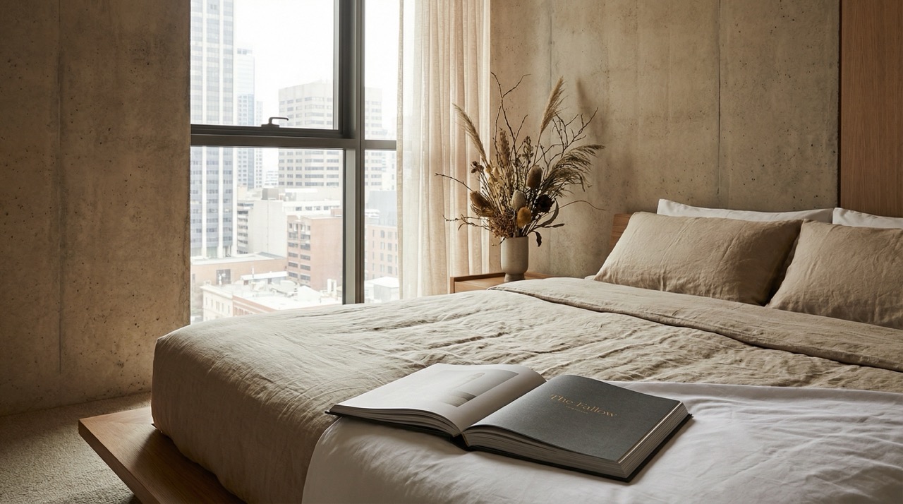
How we see this brand.
Shoot the geometry first — lines, planes, shadows, architecture before the human element. When people appear, they are always absorbed in something. Monochromatic moments punctuated by a single warm element. Matte surfaces over glossy. The feeling of a museum after closing.